For the editorial project we were asked to illustrate two articles from the New York Times (working one at a time). The first is titled "Billionaires' Row and Welfare Lines" and can be read
here.
I was excited to start this project, being fan of many editorial illustrators including -
Victo Ngai
Bill Bragg
Lizzie Stewart
Amyisla McCombie
It is important to remember that you shouldn't have to change your way of working to suit the kind of illustration you are making, so I admire that these artists' unique styles shine through in their editorial work.
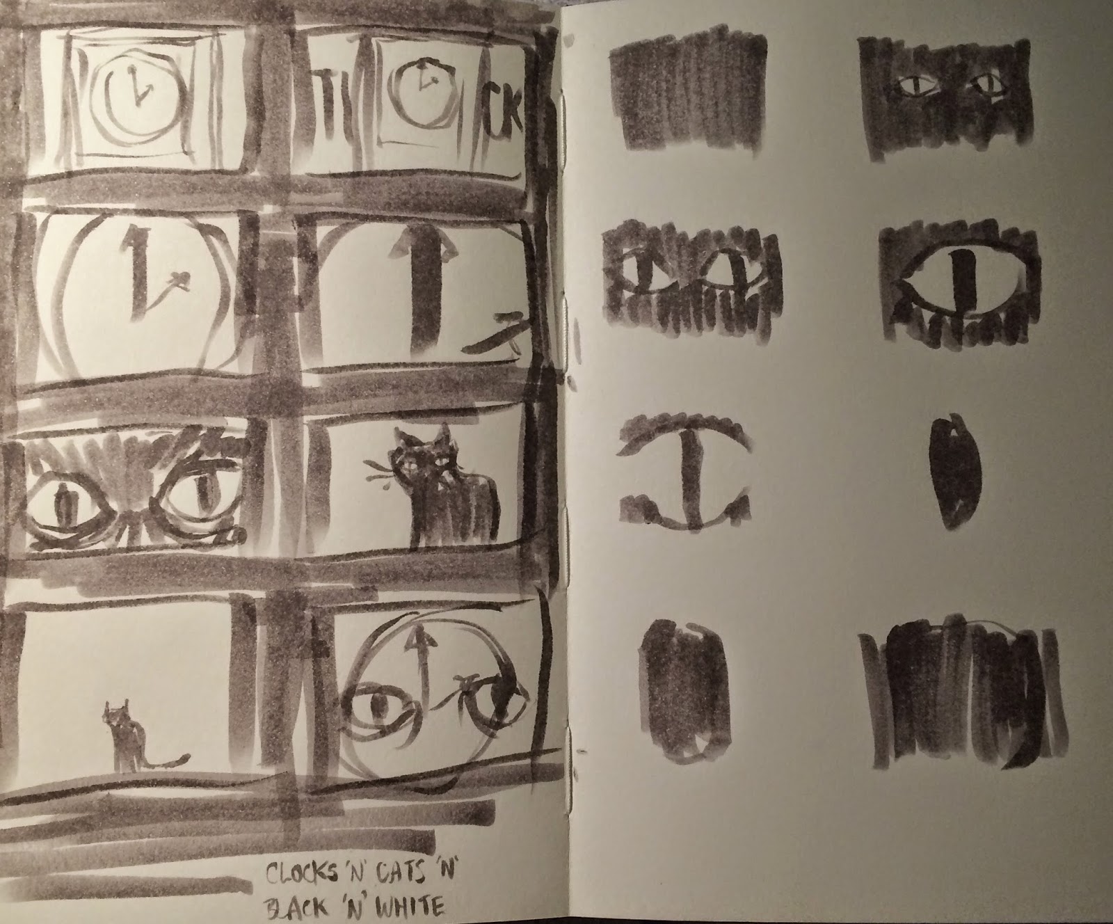
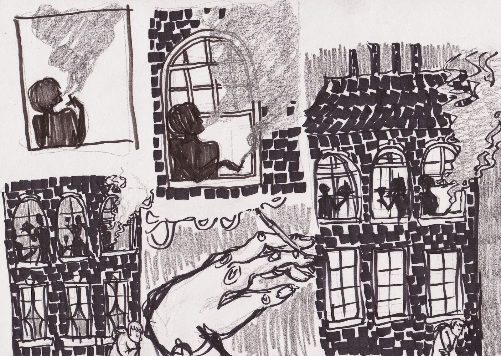
I began work by sketching out initial ideas based on imagery that entered my head while reading through the article, and quickly found myself drawn to the idea of towering buildings looming over 'insignificant' people. From here I experimented with collage, which I found helped give more impact to the images. I really liked the brick-like texture I got by dragging a marker pen onto the page a little at a time.
I realised that the smoke coming from chimneys could be interpreted as a representation of working class, but really liked the idea of smoke so tweaked my idea to a woman smoking cigarette out of a top window.
I knew I wanted to work digitally for the final piece as it had to be in full colour, and I am much more confident with colouring digitally, but didn't want to lose the textures that were present in my roughs. I got around this by scanning in the texture I made using marker pen, and used a graphite-like brush in photoshop for the rest of the image.
The second article is titled "The Solace of Digital Addiction" and can be read
here. It has quite a different tone which is quite poetic, with lots of metaphors to play off of. I started by sketching some thumbnails of various ideas, then worked on getting down a 'style' for the potential characters in the image - I wanted to go for something digital looking, perhaps as if the figures could be in an app or video game.
It was a lot easier to achieve the look I was going for working digitally, unsurprisingly. I took the strongest thumbnail from my sketchbook and redrew it in photoshop - I really like the 'chunkiness' I got with the blocks of blue.
I then went in and coloured it to get the finished piece. I am mostly happy with the image, but I feel like the fun, multicoloured nature of my rough works were lost a little; though the article is actually quite dark and saddening, so I still think it works as a final image. Because of how the project was laid out, there was no crit on the second illustrations, which was quite disappointing as I'd have liked to get further opinions on this.