Wednesday, 11 February 2015

Edition project - visual diary

first iPad drawing / poo boy being antisocial

and some sketchbook pages -


Edition project research

Research for the new 'Edition' project.

What is an edition?


-the entire number of like or identical items issued or produced as a set ­ 
-the form in which a publication is issued
-a version of anything, printed or not, presented to the public 
- the whole number of impressions or copies of a publication printed at one time.

Examples of editions:


Jillian Tamaki - Black Beauty for Penguin Threads

The idea behind the "Penguin Threads" project was redesign classic book covers using a traditional medium (in this case embroidery), which is interestingly refreshing because so many book covers are now made digitally - it's like embroidery has come full circle in this example, it seems exciting and new. The original was hand sewn, though the printed editions are sculpt embossed in favour of time, cost, and practicality. 

Read more on the Penguin website (video interview included) and the artist's blog. 


Lizzy Stewart - "Cardigan Heart" book

I have admired the work of Lizzy Stewart ever since happening upon one of her beautiful gift cards being sold in a gallery shop. This book features a collection of illustrated stories and has been litho printed in full colour. The price is a mere £5, so not a very profitable book?! Taken from the artist's online shop, though I wish I could own it.


Daniel Jamie Williams - sticker set

Stickers are a cheap and fun form of an edition! To my knowledge, these were drawn digitally and printed onto vinyl. This method makes it an easy option to have further editions printed in the future. Found in the artist's online shop.


Yumi Sakugawa - "A Special Message For You Hand-Delivered To You From The Universe" (comic book)

This book is made up of a collection of comics by the artist. Though physical copies are also available, it is also being sold as an e-book as a PDF file, which means the editions are unlimited and the artist cannot lose profit. It is also cheaper for the buyers and environmentally friendly! Everyone wins. Found in the artist's online shop.


James R. Eads - "The Light Visions" Tarot card set


This card set is by illustrator James R. Eads. The cards were hand drawn initially and have been most likely digitally printed, though designed to resemble woodblock printing. There were 500 made sold at $66 per pack, contained in a wooden box with a hand carved design. A beautiful example of packaging design, found on the artist's website. 


James R. Eads - moe. New Orleans poster

The artist above also makes beautiful screen print concert posters that are used for the event and then sold as collectors items. This print was sold in an edition of 170, costing $40. Though it is a poster, it is so intricate and skilfully drawn that I believe it is an art piece in its own right. More on the artist's website.


The Fantastic The (John Gourley & Austin Sellers) - The Satanic Satanist album art

My favourite album art - I own the limited edition foldout version (cannot find information on this but I believe the signed editions were limited to 1000), where there are multiple paper cutout layers that fold out into an art piece. Amazing!!!

The Fantastic The (John Gourley & Austin Sellers) - Poketo x Portugal. The Man Wallet

More merchandise by the same artists - not sure how many were produced, but they made three limited edition wallet designs made of digitally printed artworks on paper, and a plastic protective layer, which is stitched on. Each wallet also comes with a little badge! I believe they were sold for $20 each. I am lucky enough to own two. More on the artists' website.


Thursday, 29 January 2015

Competition

For the competition project, I chose the YCN Pan Macmillan brief, which was to design a new cover for "Alice's Adventures in Wonderland", and up to two inside illustrations.

I started off by creating some research boards on pinterest - one for general Alice imagery, and another for children's illustration. They can be seen here and here, but here are some previews!


I started out by making lots of drawings of the different characters, key objects, etc, to get a basic feel for the mise en scene and to coin a way of drawing the characters. I wanted the drawing style to be simple, but delightful and wacky. I opted for a 'chunky' look to all of the characters which I really had fun with! I like my caterpillar design the best.


Though I was really enjoying sketching everything with my trusty turquoise brush pen, I did some digital sketching as it's what I'm most comfortable colouring in so I wanted to play to my strengths. I found that it lost a bit of charm this way, so I tried scanning and colouring some sketches in photoshop, which worked a lot better.


After lots of thumbnail sketching, I decided on the three compositions I wanted to use. I liked the front cover test a lot, so I scanned it in, printed it out, and went over it again on better paper of the correct dimensions to use for the final image.


I ended up thinking that the caterpillar illustration was too visually hectic so I didn't finish it, despite him being my favourite character! Upon reflection, I could easily narrow it down into an oval shaped composition, like the cheshire cat picture.

For the final cover design, I like what's going on with the actual drawing but I had troubles with the type. I have considered redoing the background to make the mushrooms further apart to give the text more room, and would like to start all of the text anew. However since my crit was only the day before assessment, I will have to do so in my own time for the benefit of entering the competition. I'm glad I at least attempted the text though, as typography in general is a skill I really want to develop, so at least I've made a start and can only improve from here.


Friday, 5 December 2014

Reportage

For the reportage project, I went to brixton market as a starting point - it was an interesting place,as you can clearly see how the area is changing - how the 'quirky' shops and restaurants are rapidly taking over the locals' market stalls. I drew a fair amount but decided to change location for more inspiration as I wasn't getting much inspiration for final piece ideas. I went on the underground and found inspiration there - particularly a group of men in suits huddled together in a carriage, and the 'mind the gap' signs and announcements really stood out and felt almost amusing to me considering the theme is on pay gap.


I then walked around shoreditch and ended up in Petticoat Lane market. I found the buildings really interesting as for the most part council blocks framed the streets, then right in the centre, towering above, were skyscrapers from the financial district. Things also caught my eye on the way - a large, suited man standing outside his office smoking whilst construction workers are in the background; a man taking out the bin bags in front of a bank, etc.


When it came to combining images (for which I used a scanner and photoshop), I knew I wanted to include "mind the gap", which would combine well with an image relating to the London underground. I sketched out several compositions, and the one I liked best additionally used the smoking man and the man taking out bins - I thought the shapes of the man smoking and the bin bags were quite similar, so I put them side by side as not only does it work visually, it hints that high earners are compared to trash in the eyes of hard working not-so-high earners. I created a smoke texture to break up the image of the tube carriage, and fitted the text at the top. I think it works quite effectively, and I think that the slant on the text works too - showing the slope between the rich and poor.


Sunday, 23 November 2014

Film

I was really excited to do this project, as experimental film is something I really love!

Here are some examples of inspirational type videos


(^by my pal Mike! Woohoo talented friends)

For the first day of the project, we brought in a list of words. I used a list of fake band names I'm keeping for a project, and came up with the title "two o'clock cats forever". It makes me think of being stuck in time and infinite loops.

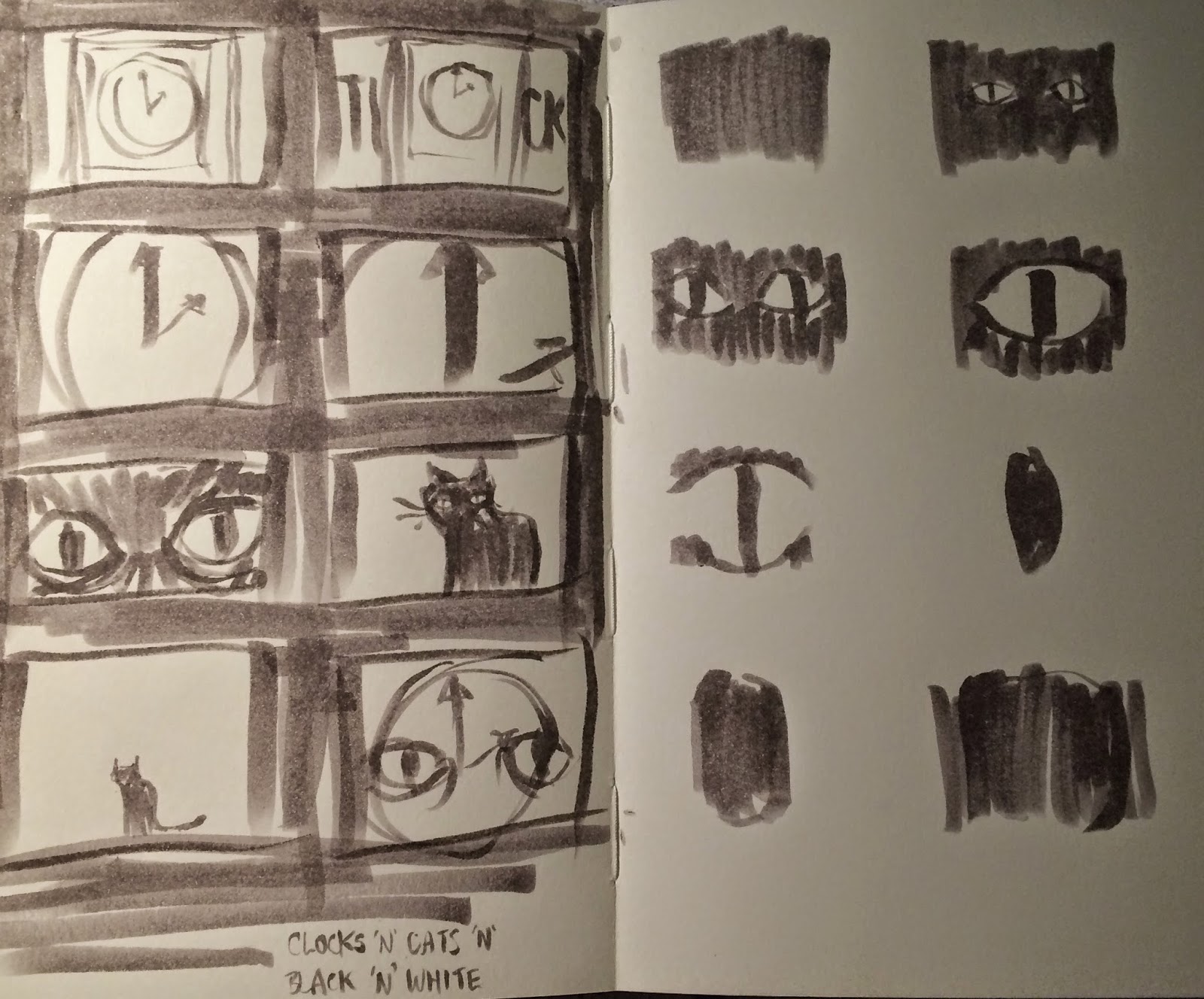
Sketches - I want a ticking clock, a black cat, and for everything to be overdramatic and black and white.


Editing is not something that is new to me so I found things fairly easy. I filmed Snoop the cat (your classic black cat, rumoured to be owned by a witch), and a clip of my watch ticking to two o'clock. Kinda has a cat->clock->cat->clock formula to mimic the ticking of a clock, with some effects added in to make things a little more arty/trippy/interesting. I think it came out looking a bit obnoxiously arty but I like that, I think it's subtly humorous.


Monday, 10 November 2014

Editorial

For the editorial project we were asked to illustrate two articles from the New York Times (working one at a time). The first is titled "Billionaires' Row and Welfare Lines" and can be read here.

I was excited to start this project, being fan of many editorial illustrators including -


Victo Ngai

Bill Bragg

Lizzie Stewart

Amyisla McCombie


It is important to remember that you shouldn't have to change your way of working to suit the kind of illustration you are making, so I admire that these artists' unique styles shine through in their editorial work.


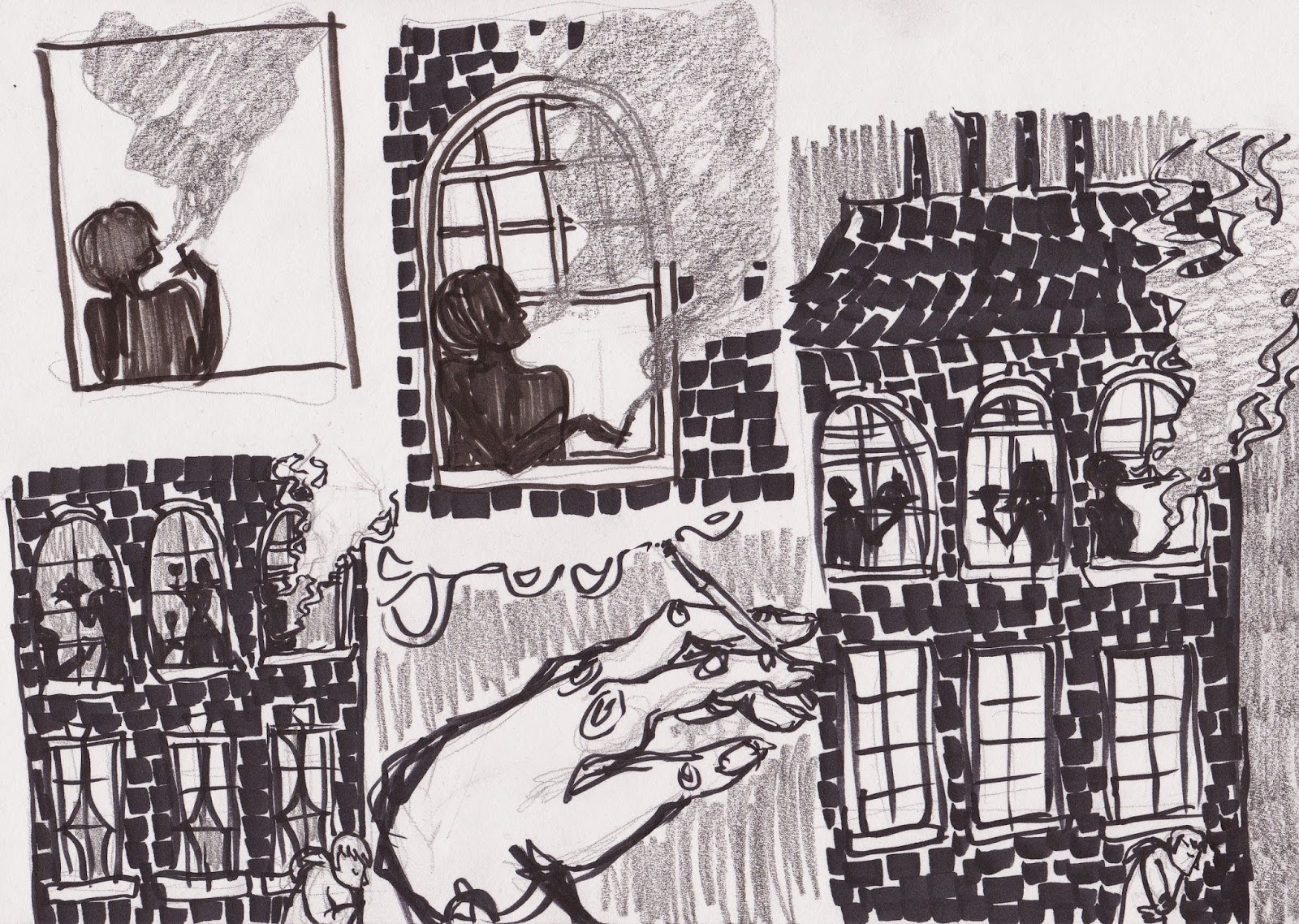
I began work by sketching out initial ideas based on imagery that entered my head while reading through the article, and quickly found myself drawn to the idea of towering buildings looming over 'insignificant' people. From here I experimented with collage, which I found helped give more impact to the images. I really liked the brick-like texture I got by dragging a marker pen onto the page a little at a time.


I realised that the smoke coming from chimneys could be interpreted as a representation of working class, but really liked the idea of smoke so tweaked my idea to a woman smoking  cigarette out of a top window.


I knew I wanted to work digitally for the final piece as it had to be in full colour, and I am much more confident with colouring digitally, but didn't want to lose the textures that were present in my roughs. I got around this by scanning in the texture I made using marker pen, and used a graphite-like brush in photoshop for the rest of the image. 


The second article is titled "The Solace of Digital Addiction" and can be read here. It has quite a different tone which is quite poetic, with lots of metaphors to play off of. I started by sketching some thumbnails of various ideas, then worked on getting down a 'style' for the potential characters in the image - I wanted to go for something digital looking, perhaps as if the figures could be in an app or video game.


It was a lot easier to achieve the look I was going for working digitally, unsurprisingly. I took the strongest thumbnail from my sketchbook and redrew it in photoshop - I really like the 'chunkiness' I got with the blocks of blue.


I then went in and coloured it to get the finished piece. I am mostly happy with the image, but I feel like the fun, multicoloured nature of my rough works were lost a little; though the article is actually quite dark and saddening, so I still think it works as a final image. Because of how the project was laid out, there was no crit on the second illustrations, which was quite disappointing as I'd have liked to get further opinions on this.