Thursday, 30 October 2014

Fiction project - final illustrations

I had a bit of a disaster with my final pieces - I was using the same (quite particular) pen to ink all of the lines, which ran out half way through, so I lost a lot of time running to the only shop that sells them, half way across London. Lesson learned - stock up on your art supplies!

I decided to stick with my strength and work with detail and line rather than colour, so made my illustrations using purely brush pen. I felt that as I had put so much care into the inking, adding colour would distract from it too much.


The feedback I got from the crit was definitely useful - I interpreted the brief as being able to choose any five scenes from the story, but was told that my five are deceptive as the final image suggests a happy, romantic ending to the story, which is untrue to the book. Another thing I failed to spot when making these was showing the character development of Erendira - throughout my drawings she looks like the same innocent, fragile girl, and fails to show how her character toughens. Was also told that the last two images particularly lack depth, which I wholly agree with, and this is where I wish I'd gone through with the cutout idea as it would have solved this problem. For me, working in A3 (the second and third images) was a little out of my comfort zone, and I think this shows in the varying detail between those and the smaller images. Still, I enjoyed making these - particularly the first two images, and believe that my work has improved in terms of placing together characters, objects, and scenes to make 'full' images.

Sunday, 26 October 2014

Fiction project - models and development work

The next step of the project was to make a model of a scene from our books - my group made the tent 'where the magic happens'. I really enjoyed all the textures and patterns from the different fabrics and took those elements into my drawings.


Inspired by the model, I decided to try making a paper cutout showing all the different layers of fabric. I love the way it looks with light shining through! I considered making images in this way for my final illustrations, though it would be ambitious (and messy, got paper everywhere making this!) to make five pieces in this way.

Stepping away from scenes, I then focused on character development. I went back to one of my drawings from the summer project and added colour digitally to see how it would look - I am happy with the outcome but still unsure of the colouring style.


The people I drew for the grandmother were all quite different in looks, so I did some drawing combining them all into one character, and also made sketches of Erendira in character. 


I also played around with different compositions for the final illustrations then narrowed them down to five thumbnails - all ready to start!


Thursday, 9 October 2014

Fiction Project - core project overview

Now that I have completed the core/summer project I have taken a step back to look at it as a whole collection of work.

The most obvious thing I've noticed is lack of colour. This is partially due to the fact I was drawing on the go and needed portable materials, but I can't deny that working in colour is challenging for me - it's something I need to build confidence on. I feel this is especially important for this project as the story itself is very colourful.

I also need to improve my ability to draw complete scenes (as in places/objects/characters combined into a 'full' image), especially interior scenes. This will be a challenge for this project as the imagery for the story is very cluttered and excessive.

I'm wondering whether it's essential to bring together the characters, props, and scenes in equal focus - can you capture atmosphere focusing mostly on objects and characters? Is there a simpler way I can draw interior scenes? Would this help to build a unique visual language? Experimenting with this should really be my next step.

Expanding on visual language - I have put my favourite images below to pick out what exactly I like about them and why they are standout pieces, so as to identify the techniques I've used so far that work the best. Perhaps I can develop these techniques to build a visual language?


This drawing stands out to be because of the variation of line, and the range of tones and depth the mixed medias have provided work well.


I enjoy subtle texture/effect here, it easily shows depth and the vastness of the desert.


These quick drawings from life captured the figures well, especially their movement and shapes.


In this drawing the markmaking, shapes, perspective, and contrast really stand out to me. Favourite drawing overall.


Here the contrast creates a good amount of impact. I really enjoy using these brush pens as a drawing material.


 I enjoy this style of 'delicate' scribbling mixed with detail.


More careful scribbling - shapes are also visually pleasing.


Apart from messed up perspective on round windows this shows a big improvement and served as a self confidence booster for drawing buildings.


Lovely lovely texture in this drawing.


Tuesday, 7 October 2014

Fiction Project - mansion time

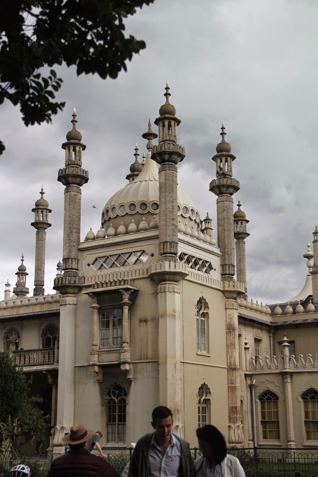
For the mansion in the story, I decided to use the Brighton Pavilion - the story is unclear precisely where it is set but there is reference to Indians, so I thought it'd be an interesting take to have the exterior of the mansion as Indian architecture rather than something more westernised.

Drawing buildings is something that is out of my comfort zone - especially detailed ones such as this - so I found these drawings really useful for my own skill development.


It's an incredible building so I got a bit fancy with my photography.


I filled up my memory card before I could get any of my own photos (and at the beach it was too windy to draw!), but I thought the west pier would be good as a reference for the burnt down mansion. Images from google -